Most habit apps punish you for stopping. Break the streak and you've failed. But the research says the opposite works better. Make it easy to return. This is the project where I ran the whole cycle myself, from the first interview to the list of things I'd fix next.
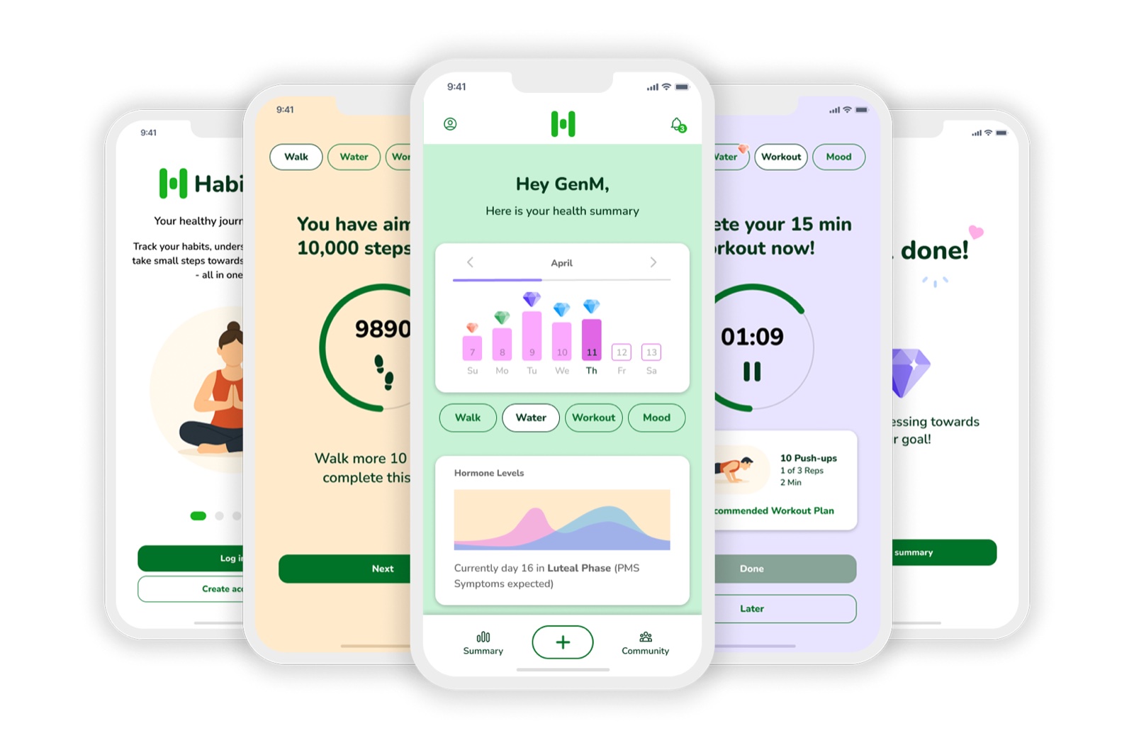
I interviewed five health-conscious people between 35 and 50, and the same words kept coming back: "I can't keep it up." They weren't lazy about it. They tracked religiously, across three or four different apps. They still couldn't tell you what their body was doing or what to change.
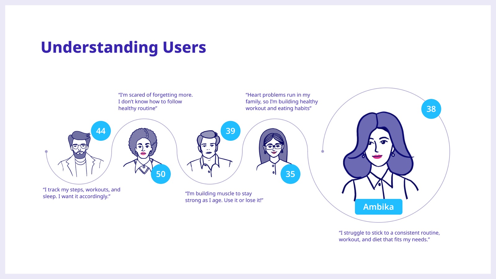
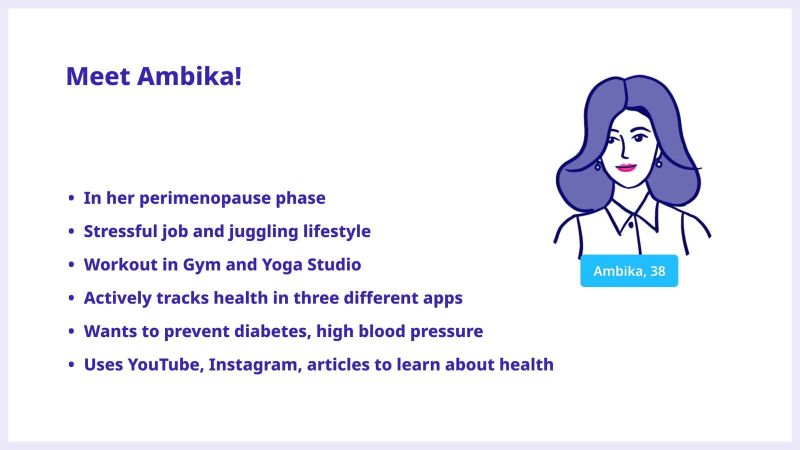
She became the person I designed for. Perimenopausal, a stressful job, a gym and a yoga studio, health spread across three apps. She wants to stay ahead of diabetes and blood pressure, and she learns about her own body from YouTube and Instagram. Every decision after this got checked against her actual week, not an ideal one.
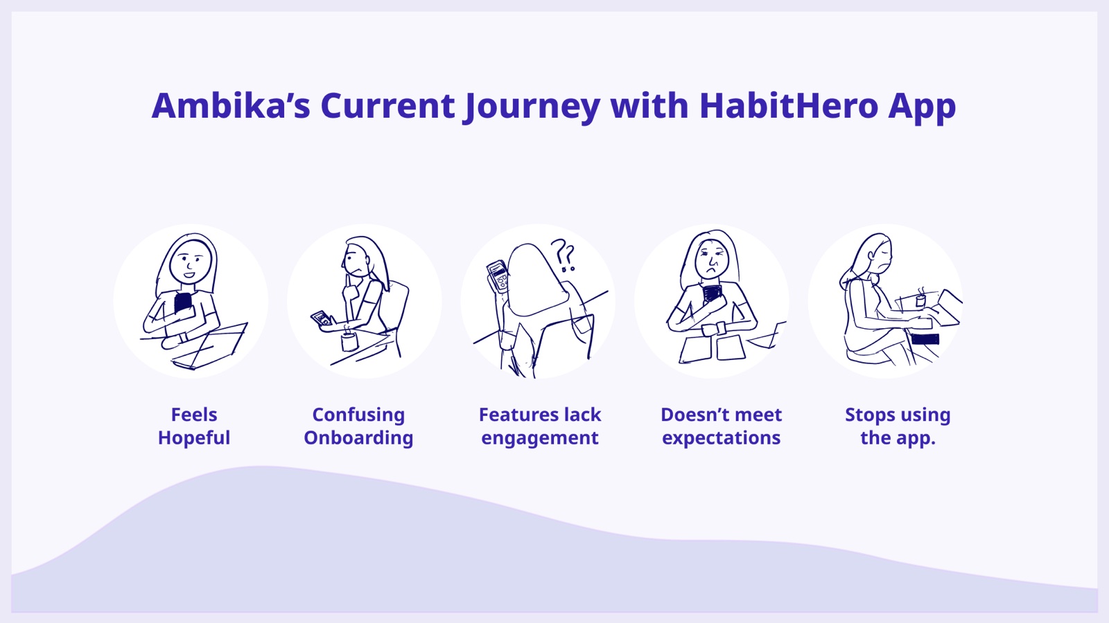
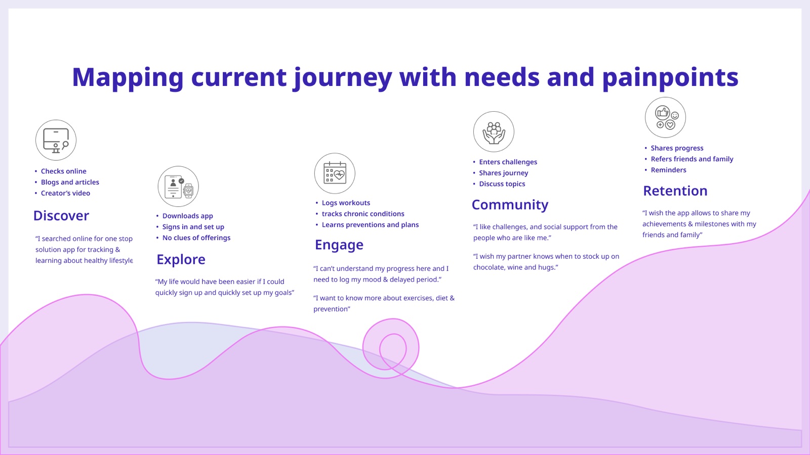
I mapped her week with the app she already had, and you can watch the motivation drain out of it: hopeful at signup, confused by setup, unengaged by the features, then quiet. Breaking it into stages gave me specific moments to fix instead of a vague instruction to be more engaging.
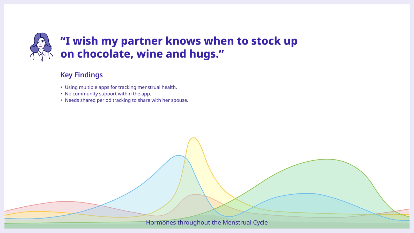
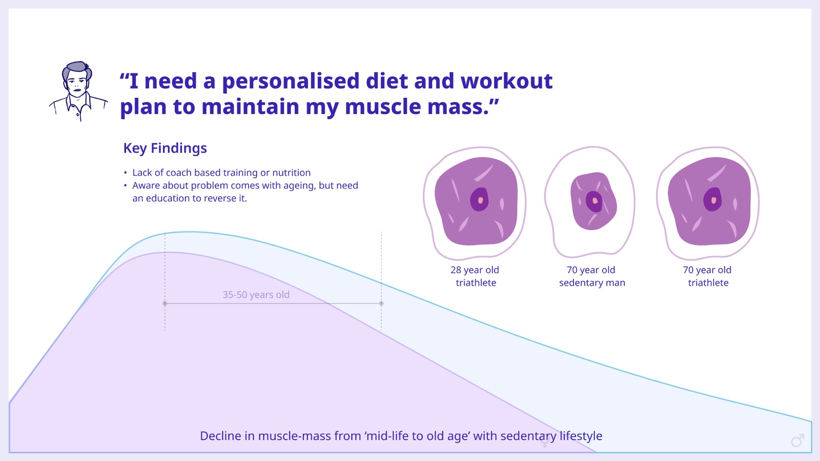
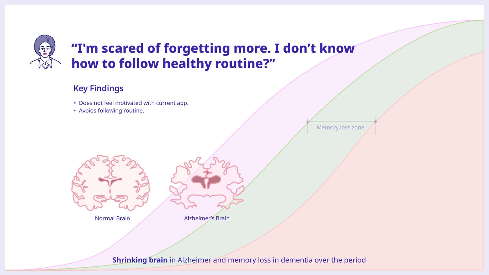
Three of the interviews pointed at three different things: how hormones shift through the cycle, how muscle drops away from mid-life if you sit all day, and memory, which people were genuinely frightened of. I put each quote next to the science that explains it.
Five things, in that order, each one traceable to a person rather than to a feature I fancied building.
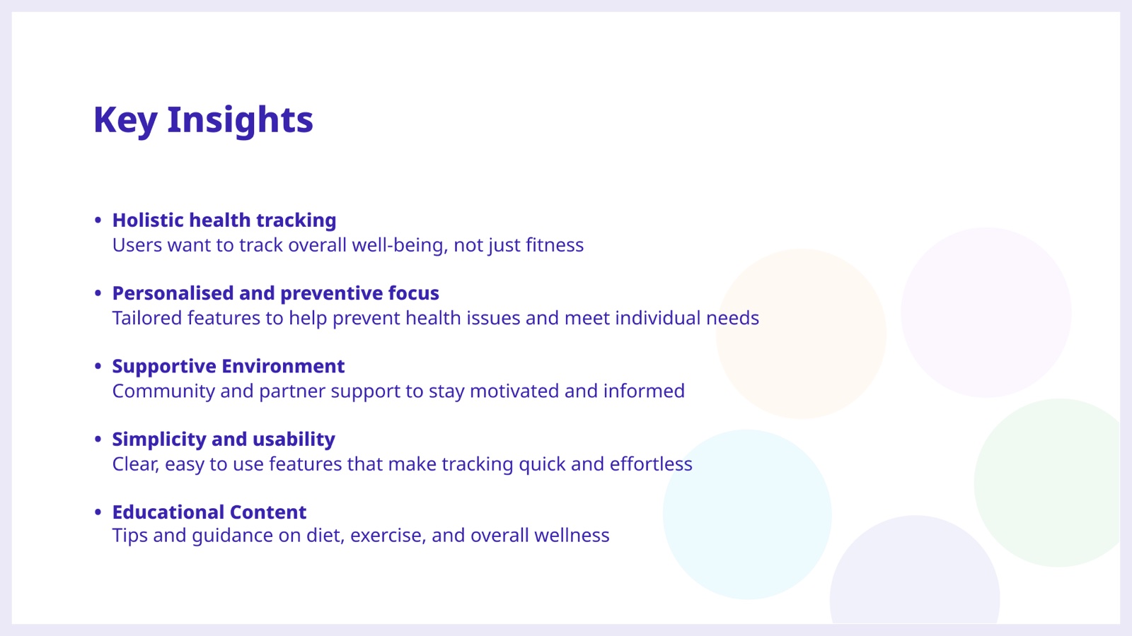
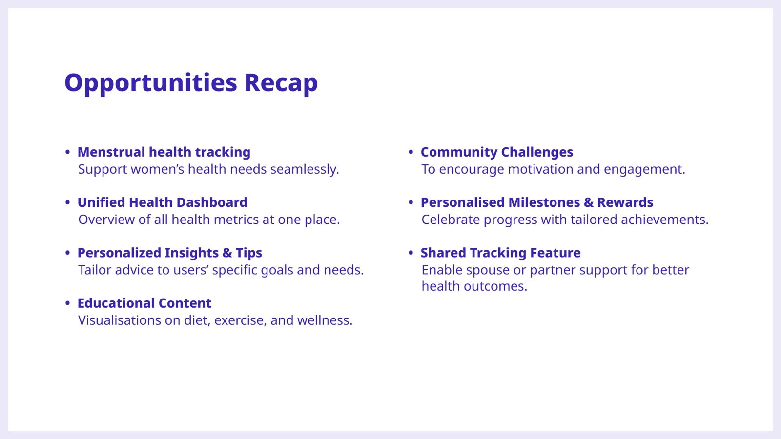
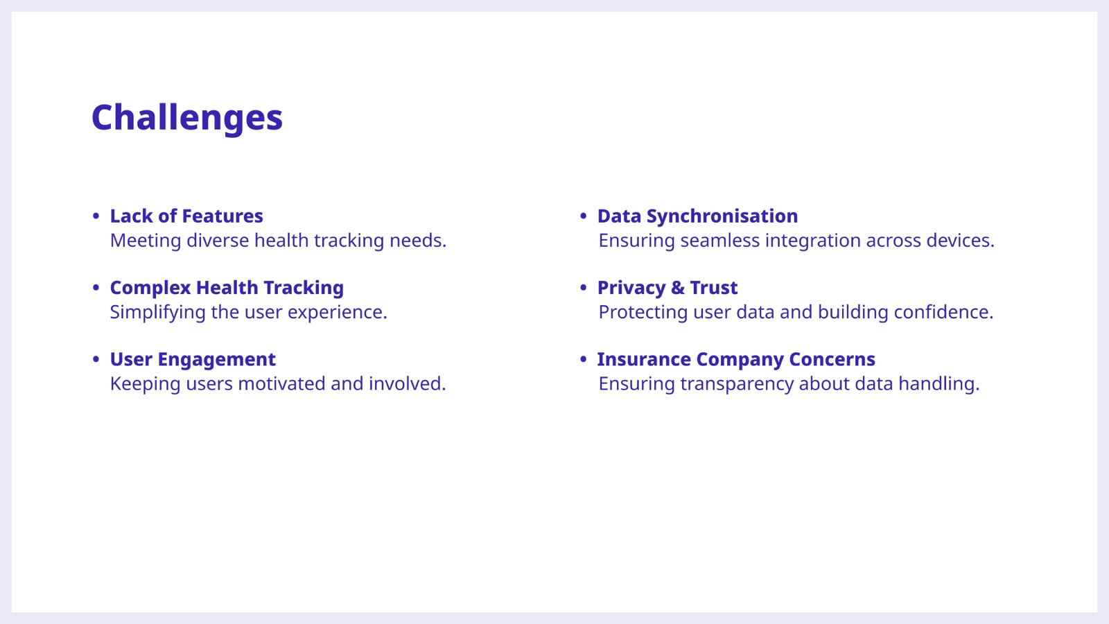
I wrote both lists at the same time, deliberately. The opportunities came from the insights. The constraints were real too: syncing data, privacy, what insurers can see, and the risk of making tracking even more of a chore. Writing them together meant scope could be argued instead of assumed.
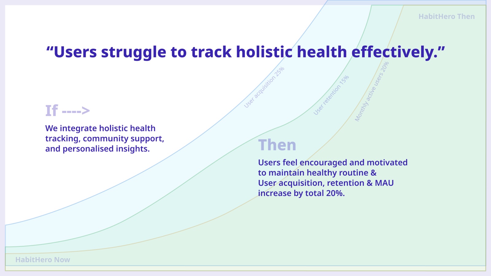
I closed discovery on a bet rather than a backlog: if we bring together whole-body tracking, community and personalised insight, then people stay motivated, and signups, retention and monthly actives rise by around twenty per cent between them. Writing it that way gave the design something to be measured against before a single screen existed.
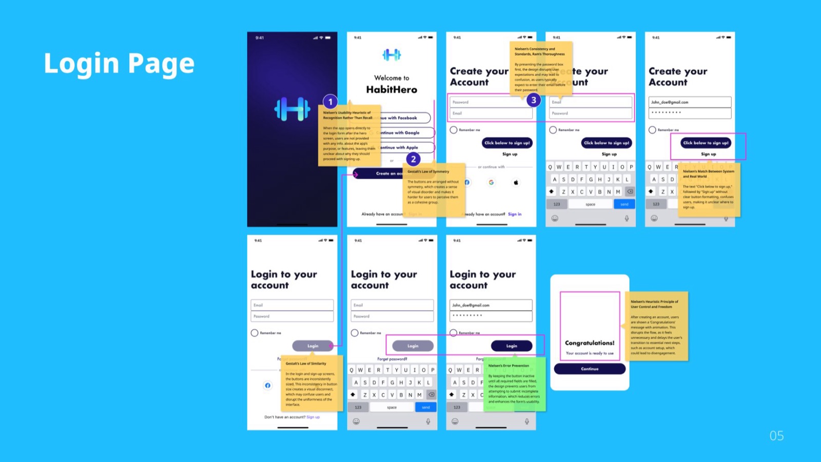
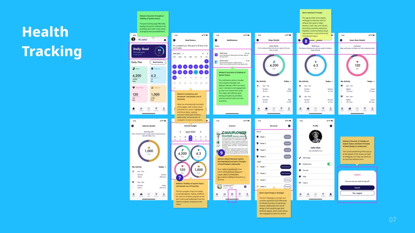
I walked the existing build against Nielsen, Gestalt and Rams. The problems were specific: words changing meaning between screens, buttons that didn't look like buttons, a password field sitting above the email field, and four progress rings you couldn't compare with each other. The green notes mark what already worked. An audit that only criticises isn't much use.
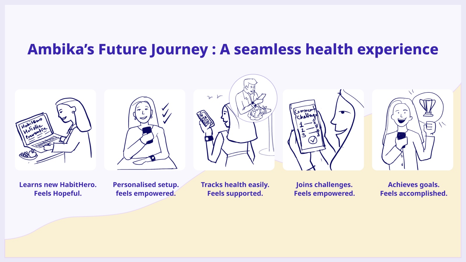
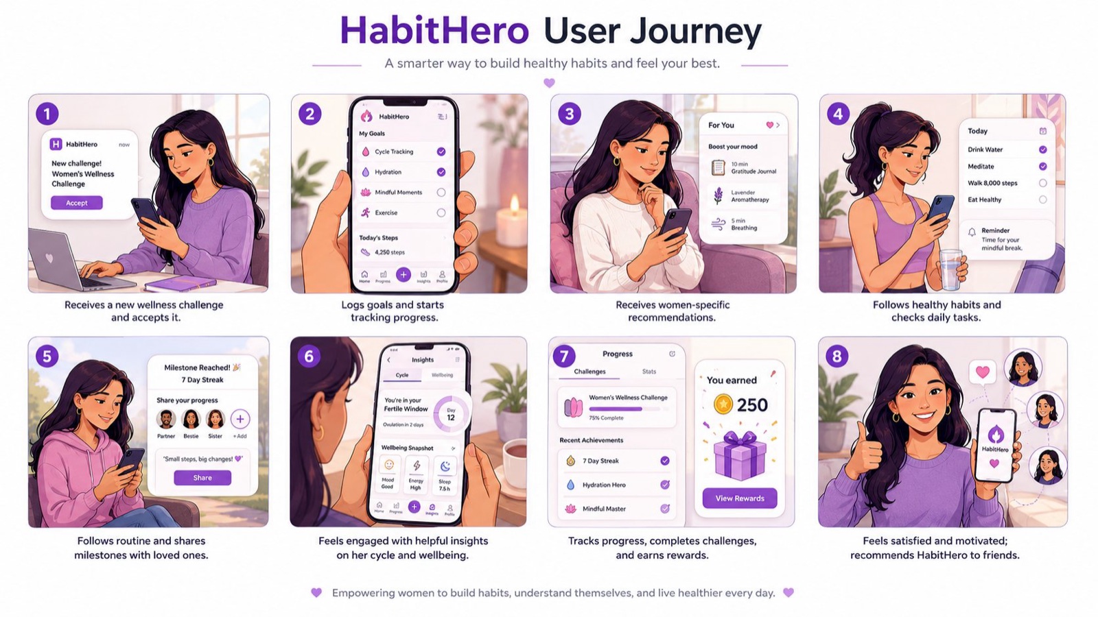
She finds the app, sets it up in a way that feels like hers, logs things easily, joins a challenge, reaches a goal. I named the feeling at each step: hopeful, supported, accomplished. Naming it gives you something to test the interface against. Then I drew the whole week out, eight panels, before designing any screens.
Logging, cycle trends, community challenges, rewards, all wired end to end. Kept unpolished on purpose: pretty screens hide usability problems, and I wanted to find them.
Try the prototype →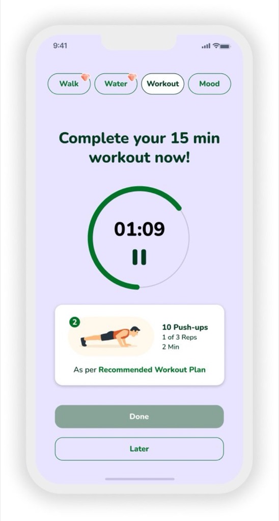
The same fourteen screens, wired together. Open it and move through them the way the people in testing did.
Two moderated sessions with people in the same age range, using their own handsets so it felt normal. Six tasks, three things measured each time: could they do it, how long it took, and how they felt about it. And a decision built in: if the findings warranted it, change the prototype and test again rather than writing a report and stopping.
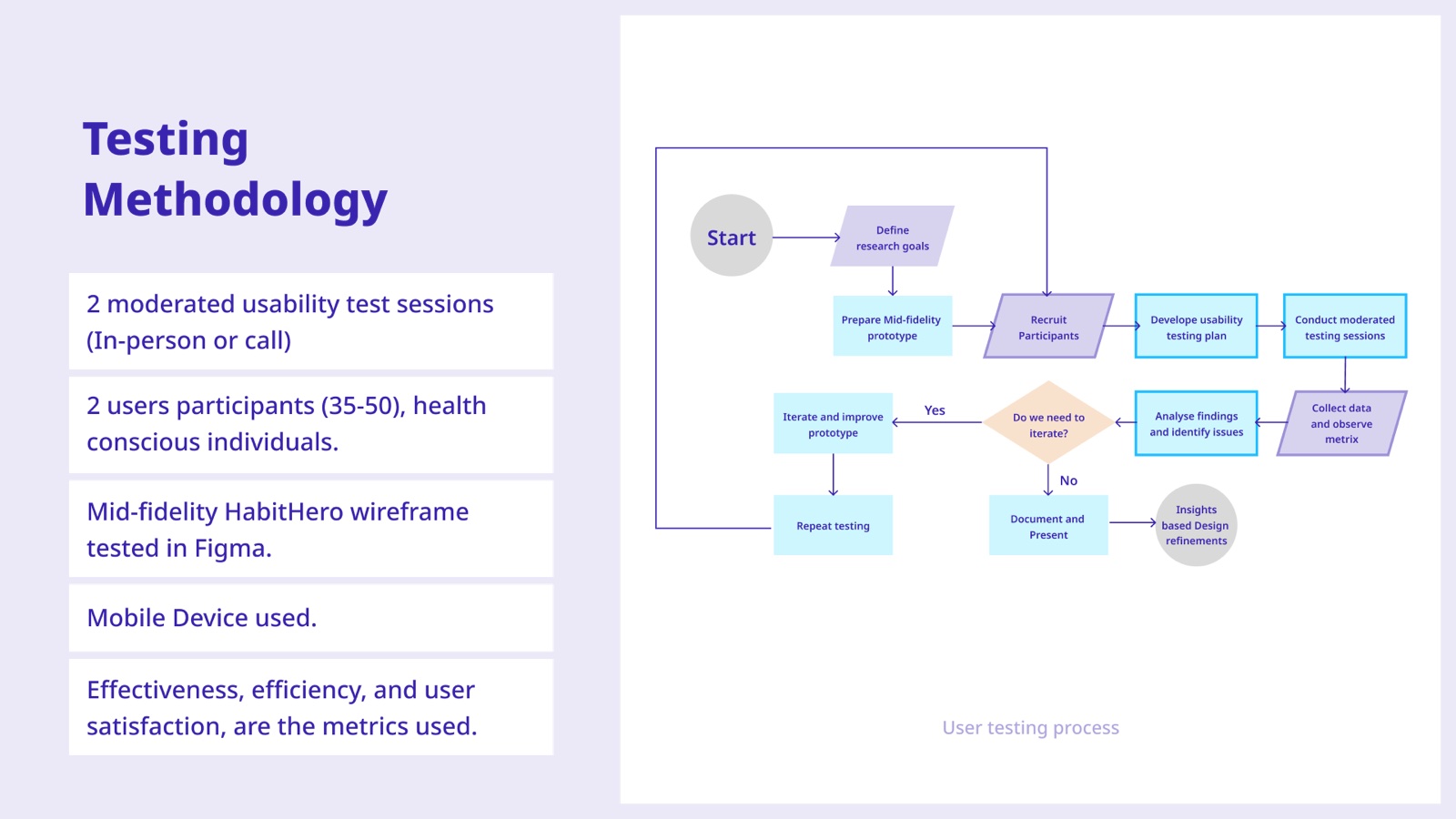
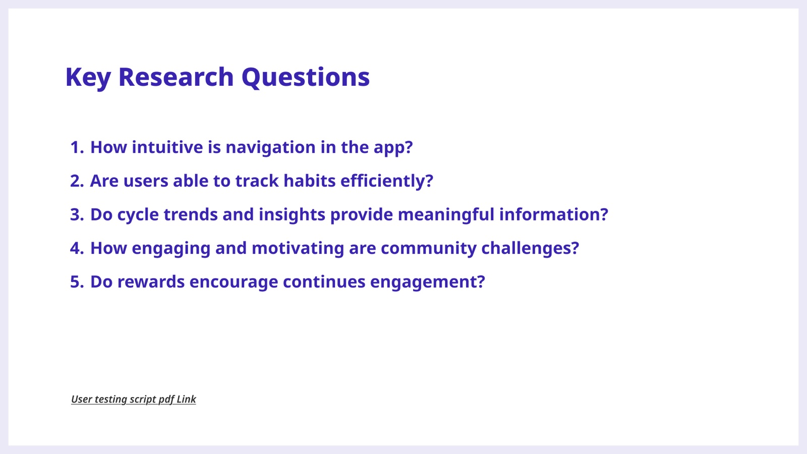
What worked, what broke, what I'd change, for getting home, joining a challenge, logging water and mood and steps, checking cycle trends, using the club tab, and claiming a reward. Keeping the shape identical means each recommendation arrives attached to the evidence for it, which makes it much harder to wave away.
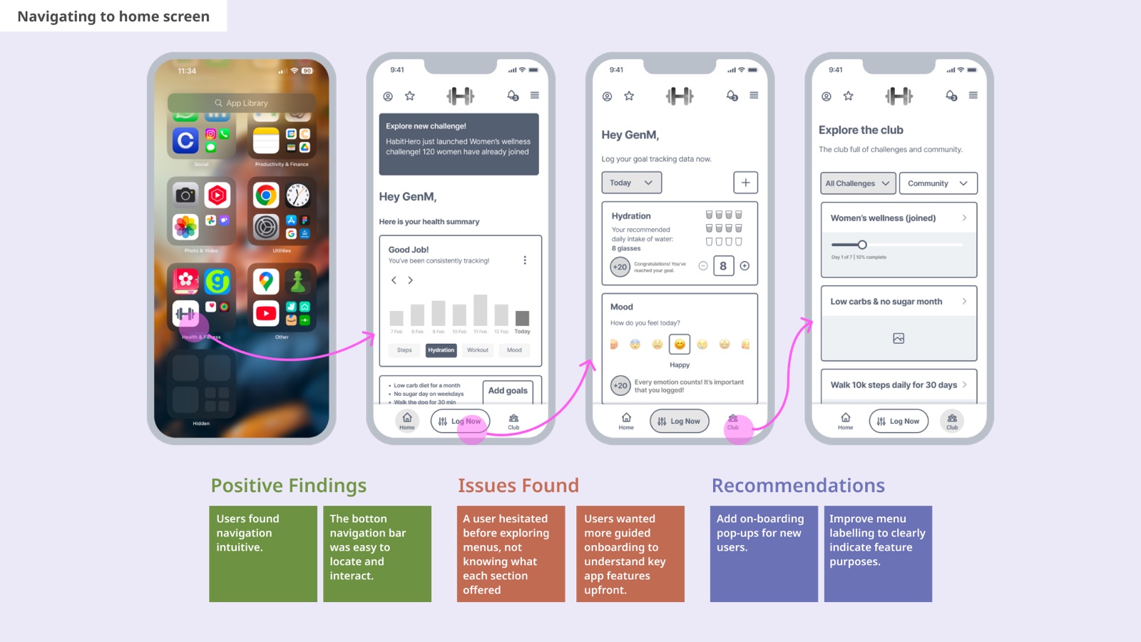
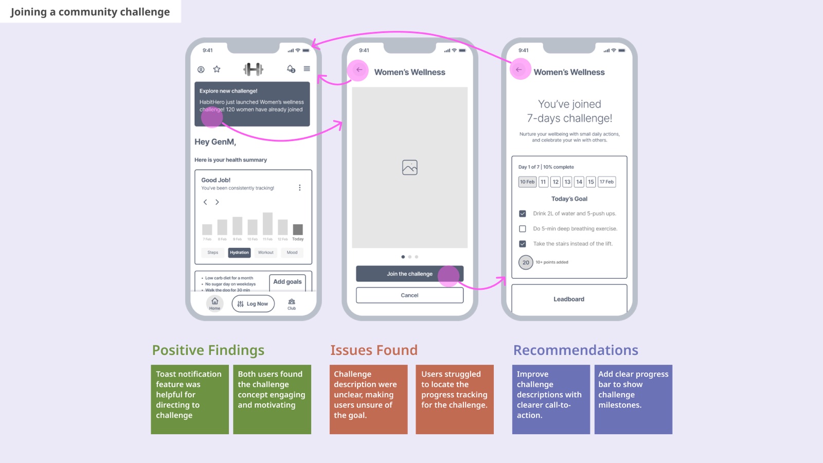
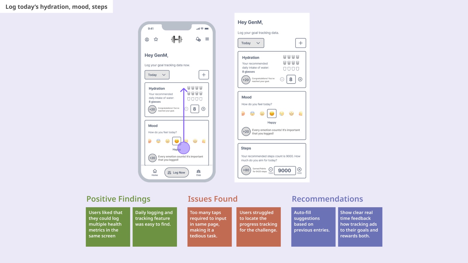
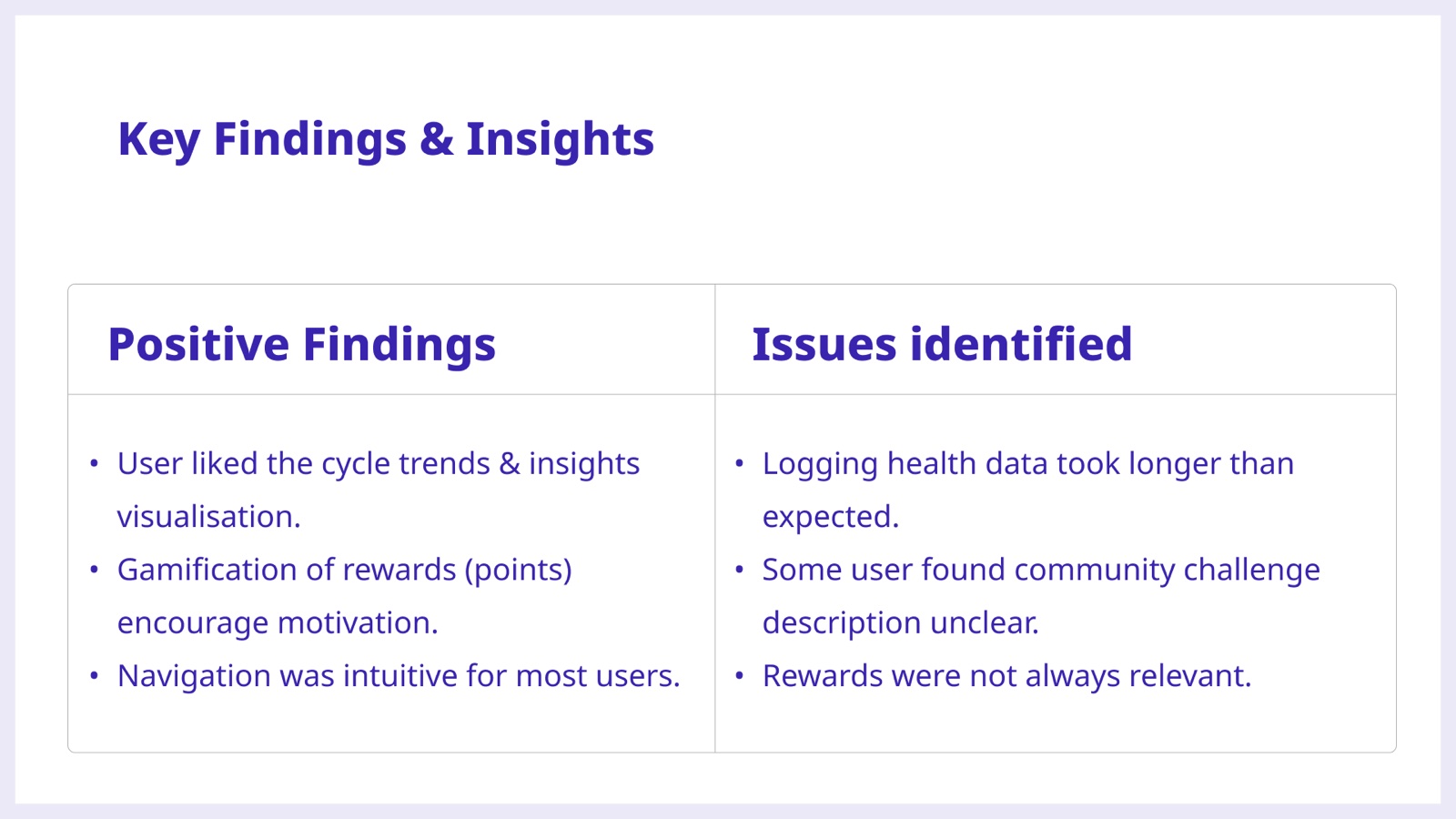
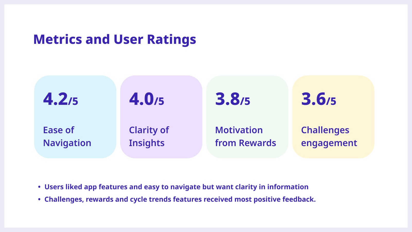
Getting around scored 4.2 out of 5, and how clear the insights were scored 4.0. But rewards and challenges trailed at 3.8 and 3.6, which matched exactly what I'd watched happen. People knew where to go. They didn't always know what they were looking at, or why a reward had anything to do with them.
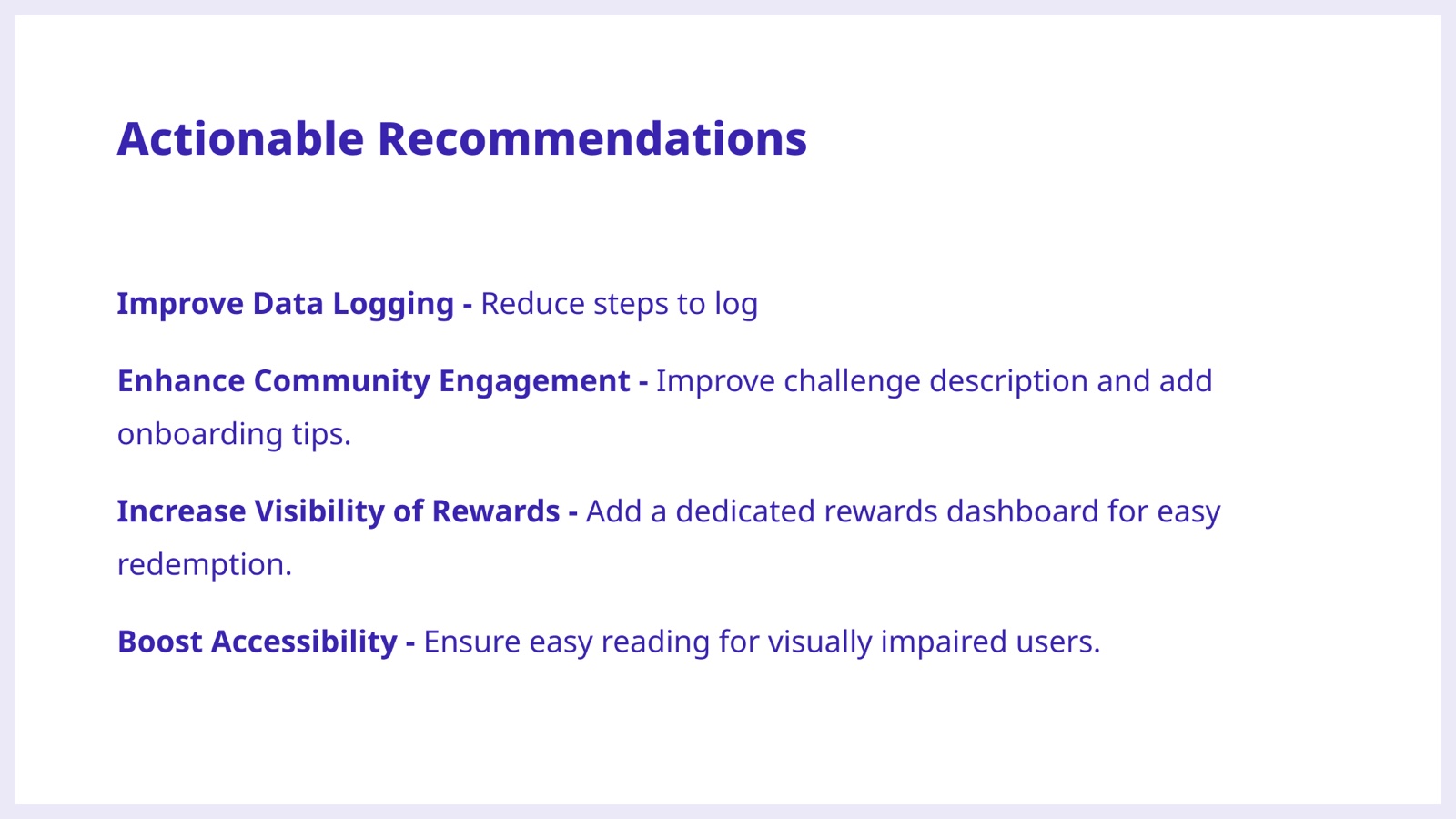
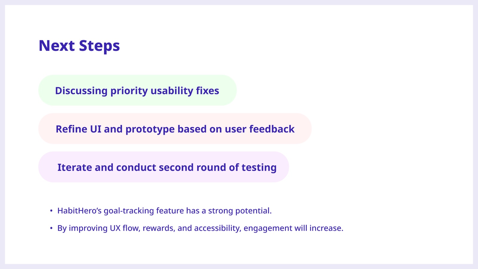
Then test the same six tasks again, so the improvement is measured rather than hoped for.
Calmer, higher contrast, bigger type. One thing at a time while you're logging, so it stops feeling like admin. Progress you can see without reading a wall of numbers. And the celebration at the moment you finish, rather than buried in a tab you never open.
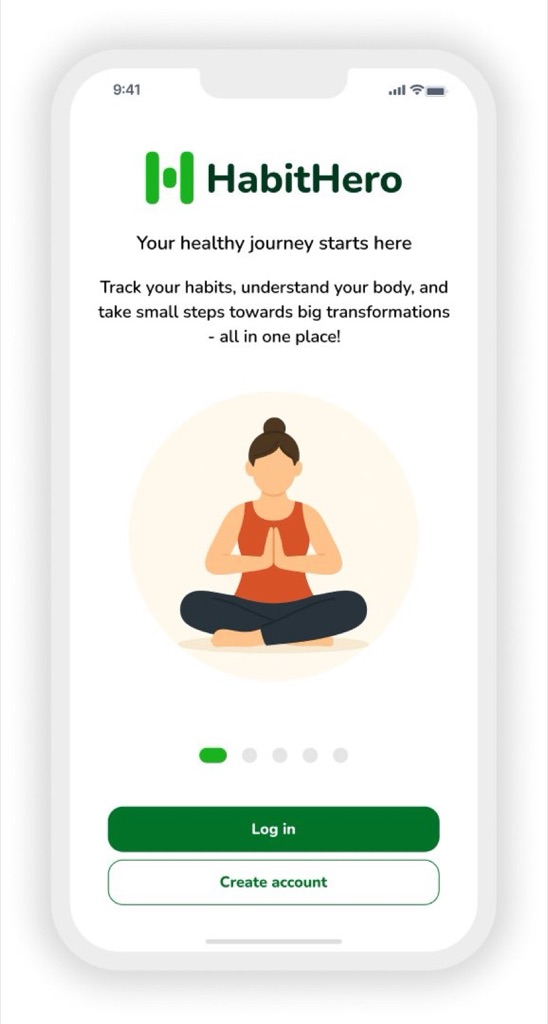
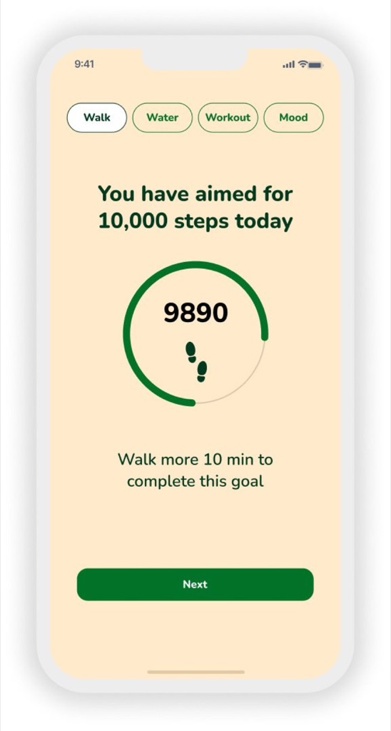
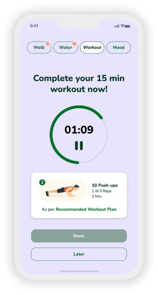
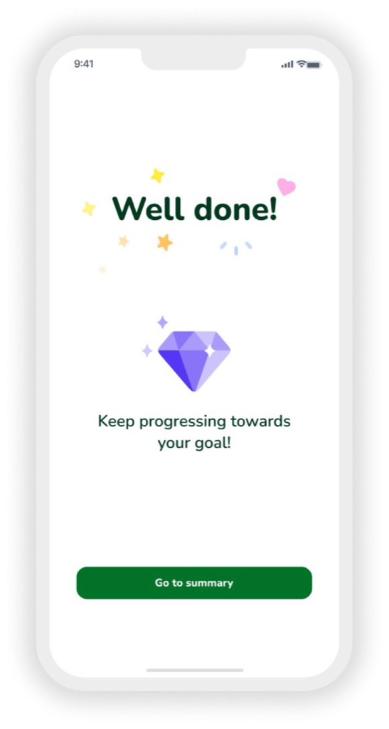
Where all of it landed: the calmer type, the one-thing-at-a-time logging, and the celebration at the moment you finish rather than buried in a tab. Click through it here.
This one took me through a whole product cycle on my own: five interviews, an audit of something that already existed, a prototype real people used, and a set of changes I can justify line by line. It's the project that turned evidence-led design from something I believed in into something I just do.
Each thing on the roadmap points back to something someone actually said, so arguments about scope stop being about opinions.
Writing it as if/then, with numbers, made the work measurable before I drew anything.
Two sessions found problems no survey would have caught: taps that felt tedious, words people read straight past.
Findings written the same way each time made the next round of work obvious to whoever picks it up.
The same pattern works for anything that asks people to keep coming back: renewing a benefit, booking a check-up, finishing a course.